Objective:
Identify what is bad interface design, navigation, functionality, interactivity, content distribution in a website or app and find a positive solution to that site.
Understand in practice how the Principles of UI Design affect the user interface and experience.
Considerations:
Search for sites that don’t respect three or more of the six Principles of UI Design. Look for font, color, navigation, buttons, links, graphics, sounds, etc.
The structure principle:
Design should organize the user interface purposefully, in meaningful and useful ways based on clear, consistent models that are apparent and recognizable to users, putting related things together and separating unrelated things, differentiating dissimilar things and making similar things resemble one another. The structure principle is concerned with overall user interface architecture.
The simplicity principle:
The design should make simple, common tasks easy, communicating clearly and simply in the user’s own language, and providing good shortcuts that are meaningfully related to longer procedures.
The visibility principle:
The design should make all needed options and materials for a given task visible without distracting the user with extraneous or redundant information. Good designs don’t overwhelm users with alternatives or confuse with unneeded information.
The feedback principle:
The design should keep users informed of actions or interpretations, changes of state or condition, and errors or exceptions that are relevant and of interest to the user through clear, concise, and unambiguous language familiar to users.
The tolerance principle:
The design should be flexible and tolerant, reducing the cost of mistakes and misuse by allowing undoing and redoing, while also preventing errors wherever possible by tolerating varied inputs and sequences and by interpreting all reasonable actions.
The reuse principle:
The design should reuse internal and external components and behaviors, maintaining consistency with purpose rather than merely arbitrary consistency, thus reducing the need for users to rethink and remember.
Deadlines & Parameters:
Intro to Worst of Web
- 1) Due/posted before the beginning of Class 2 – Choose a “really bad, poorly designed web site” (either fine art or commercial).
. Write how the site makes you feel.
. Why makes you feel like that?
. What are the principles being broken?
Post the link to the bad website along with the answers for the three questions into a new page in your E-Portfolio. Make sure you have a list of at least 5 reasons why it is that bad according to the Principles of UI Design. - 2) Class 2 – Present the “really bad site” you have chosen as well as the list of at least 5 reasons based on the Principles of UI Design why it is that bad. Be ready to defend your reasons.
- 3) Class 3 – You are expected to create a proposal offering the information architecture (site map) and a new design by drawing mock-up/wireframes for two pages ( home page and a second page) for web and phone in Photoshop (jpg). Post to your E-portfolio site.
- 4) Class 4 – Design the two pages ( home page and a second page) for web and phone in Adobe XD based on your proposed site map and wireframe.
- 5) Class 5 – Create the other two pages and implement an interactive prototype for phone in XD with four functional/linked pages.
- 6) Class 6 – Create the other two pages and implement an interactive prototype for Web in XD with four functional/linked pages.
- 7) Class 7 – Share your phone and web prototypes links on your E-portfolio.
Your redesigned static digital mock-up doesn’t need to be fully functional – it can be a still Photoshop layout of the homepage – BUT it must address the issues you pointed out as not working in the original “bad” design presentation.
You have complete freedom to TOTALLY redesign the look and feel of your chosen site (that includes all graphics, content, type, layout, and navigation.)
This is not about a subtle “tweaking” of existing material – this is a COMPLETE redesign. You should also include the flowchart for your proposed navigation structure.Please compress any PSD into JPG redesign files and present them as an uploaded HTML page.
The final four linked pages in html interactive digital mock-up should be based on your static mock-up (Photoshop version).
Four Final Interactive Prototype Pages:
- Home
- About
- Contact
- A Link Page
Specs:
- Version for Web
- Version for Mobile
- Color Mode: RGB
- Resolution Size: 72 dpi
Grading Criteria: 20 pts + Posting 4 pts
Due Class 2
- “Really bad site” research, link and presentation of at least 5 relevance & interesting issues that don’t follow the Principles of UI Design. Name the issues and the Principles ignored. 2 pts
- Posted by class time 1 pt
Due Class 3
- Presented “Really bad site” site proposal 1 pt
- Presentation/posted Site Map. 1 pt
- Presented “Really bad site” redesigned wireframe 2 pts
- Posted Proposal + Site Map + Wireframes by class time 1 pt
Due Class 4 & 5
- Collected images and content to reproduce the digital mock-up with four pages. 2 pts
- Created four digital mock-up pages in Photoshop addressing the found issues. 4 pts
- Linked the four pages in Dreamweaver to create an interactive mock-up. 4 pts
Due Class 6
- Shared the interactive mock-up files and presented “Really bad site” redesigned with the 5 issues addressed 2 pts
- Interactive prototype has proper file organization. 2 pts
Due Class 7
- Posted interactive prototypes links to personal E-portfolio site 2 pts
Resources
- Initial Planning: Site Proposal
- Information Architecture: Site Map | Navigation
- Wireframe: Sketches
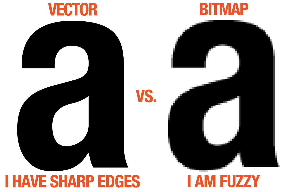
- Raster x Vector
- Photoshop: Image Optimization
- Mock-Up Site Tutorial
- Adobe XD
- File Management: https://youtu.be/7YB6FxYvQr4
- Sketch Mock-up & Grid
- Photoshop Basics
- Visual Communication in UI Design
- UI Design Videos
- Design Principles: Unite, Emphasis & Focal Point