How To:

Tutorial exercise on Optimizing Images
Contents
Website performance is an important SEO and user-experience factor, and a critical part of modernizing an outdated site. Any long delays in page load times might cause your website’s visitors to lose trust and leave. So choosing the right image size/dimensions is of critical importance these days!
For photography websites, images are the overwhelming performance factor. And with half of your visitors using a mobile device, controlling the image size is needed for running a successful website these days.
Let’s cover the 3 main aspects of website image optimization (for performance):

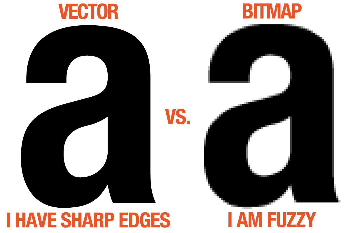
1. Image size (dimensions in pixels)
Regardless of file formats (JPG, PNG, GIF, TIF etc.), you should never upload high-resolution images to your site just for display purposes.
The only exception is if you have a protected image archive which also serves prints & image licenses (like PhotoShelter, which has security measures in place at any time). Otherwise, if you’re just displaying images in a portfolio or a blog post, never use images at their maximum dimensions.
a) Full-width slideshows
For full-width slideshows (that automatically stretch to the full size of the browser), I recommend going for 2560 pixels in width, which is the common resolution width for 27″ and 30″ monitors.
Images can have any height you need, to create an aspect ratio you’re comfortable with. For example, for full-page slideshows keep the original aspect ratio of images. But for smaller slideshows at the top of a homepage, try to keep the images shorter (to an aspect ratio of around 3:1 or more).
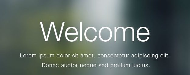
Here’s an example of such a slideshow from a recent photography website I built:

b) Smaller images / thumbnails
Figure out how large the site displays them (using your browser’s “Inspect Element” tool, or to a screenshot of your site and measure the image size) and double that.
For example, this website displays thumbnails (below the main slider) at 320×214 pixels.
 But if we take a closer look, the website uses a double image size (640px wide) so they look crisp on retina displays:

c) Large images in “lightbox” displays
Whenever an image needs to enlarge on screen (like in a lightbox display after clicking on a thumbnail, possibly part of a gallery slideshow), keep them to a max of 1500 pixels in width (and a max height of around 800-900 pixels), that’s usually acceptable.
Restricting the image dimensions like this will keep the file size reasonably small, for a faster transition between images (if the slideshow allows navigating between images):

2. Image quality/compression level
a) Exporting JPG images
Assuming you’re using a tool like Adobe Lightroom, you almost never need to export images at 100 (in the quality slider). Choosing something like 60 or 70 gives you good-enough quality at much smaller file sizes.
 Only when you start to go lower than 50-60% do you start getting discernible image noise. But between 100 and 70-80, the quality difference is imperceptible, while the difference in image file size is huge.
Here’s an experiment I did with exporting an image at different quality levels:
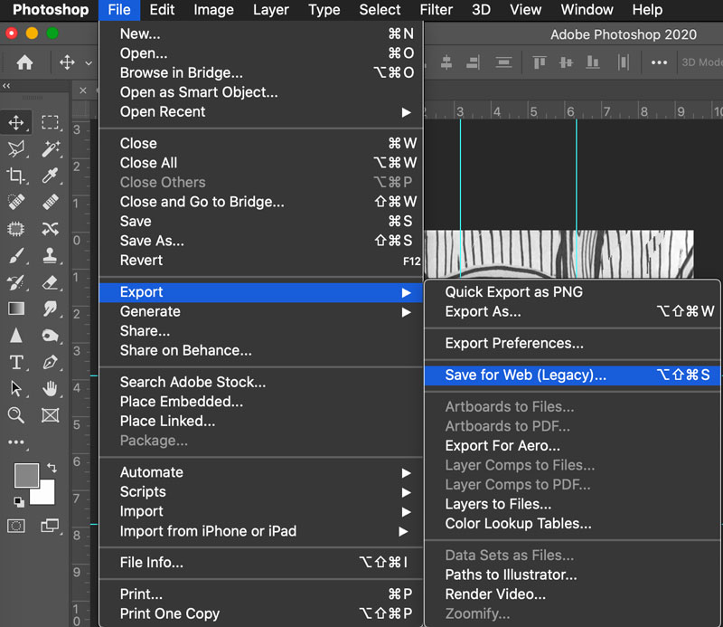
 A similar principle applies if your exporting images from Adobe Photoshop.
And if you’re using the latest version of Photoshop CC, be sure to use their new export dialog under File > Export > Export As…
 Then do some experimenting and choose a compression level that you’re comfortable with. Once again, most people find 60% – 70% an acceptable compromise (between image quality and file size).
b) Using PNG/SVG/GIF for graphics with solid colors
Your website likely contains other graphics separate from your regular photos, things like logos, icons, screenshots, banners etc.
Any graphics that contain areas of solid color (created by you in Photoshop or other tools online) could be better saved in other lossless file formats. PNG, SVG and GIF formats can work well in such cases.
Let’s take one of the graphics I used above in this article as an example:
 You have to test this out yourself, on a per-image basis. Always try to use lossless file formats (like PNG or GIF) when you can get smaller file sizes (compared to JPG).
But like I said, this only holds true for graphics with solid colors. Whenever you try this same experiment with a regular photo (taken with your camera), JPG usually wins (by a lot).

3. Extra compression using tools or plugins
OK, so you’re ready to upload images to your website.
a) WordPress plugins
If using WordPress, you’re in luck. There are a bunch of great plugins that do a lot of work for you, automatically. They take every image you upload, and then compress it (in a lossless way) to optimize the file size.
Imagify, Smush.it and Kraken are popular solutions, but my favorite is ShortPixel:
 A free account with them gives you a decent monthly quota, and you can get a premium plan to allow optimizing many more images per month if you need to.
The plugin’s “glossy” optimization level offers a good compromise between image quality and file size, but you can switch to the “lossy” or “lossless” optimization levels as you see fit.
If you can, I recommend bulk-optimizing all your past images (from the WordPress media library):
 Here’s how ShortPixel stacks up against Imagify, Ewww and other image optimization tools.
More useful WP plugins here:

b) Other image compression tools
If you don’t use WordPress, you can try other desktop or online tools to “squeeze” your images.
Here are some of the best resources you could use:
- Imagify (online, free & paid options)
- ImageOptim (free, Mac)
- PNG Gauntlet (free, Windows)
- Trimage (free, Linux)
- JPEGmini ($20, Mac & Windows)
- more here
How to know if your site has a problem with image sizes?
When you test your site in Google PageSpeed Insights, you’ll see something like this:
 Google is recommending a lossless compression of some of the images to save data.
Alternatively, you can use this great new performance tool: Page Weight by imgIX
 Type in your URL and it analizez how images affect your page, here’s an example:
 Please be aware though that it can through false negatives. The report can tell you that you can resize a specific image smaller than what your site actually needs.
Conclusion
Please expect websites to be really fast. If you care about your site performance (and, in turn, its SEO), you need to control the size of your images.
For advanced users, you can take it one step further and read Google’s “Image optimization” article as part of their Web Fundamentals guides.
As I mentioned in the beginning, this doesn’t apply to image archiving services (which have built-in security measures, and which generate low-res thumbnails from your original high-res files, as needed by the site), or whenever you sell those images as downloads or prints. But if you have a self-hosted site and just need to showcase your images on the web, following these image optimization best-practices is a must.
So take some time this week to:
- update your image exporting and uploading workflow
- consider going back and optimizing your site’s existing images (and testing your site’s performance before and after the changes)
