Objective:
- Establish prior learning experience with web sites.
- Describe and critique web sites, and articulate visual ideas using web-related terms.
Introduction:
Did you ever come across a website or a phone app that you thought was really bad?
Do you remember what site or app was it and your overall feeling while experiencing it?
What negative characteristics of the site called your attention?
- the design was overwhelming,
- the font size was too small,
- too many colors.
- the colors had too much or too little contrast,
- the buttons didn’t work,
- the navigation was confused,
- forms were too long and a small mistake on your part reset the content already filled out,
- links are not clearly defined,
- or whatelse really called your attention for its negative qualities related to the interface and interaction design?
Description:
In this Assignment you will share the URL (the web address) for a website that really calls your attention for its bad qualities: design and/or interaction based on the Principles of UI Design. Also share how the site makes you feel and the issues with the site that are problematic for you.
Considerations:
We are all experienced web users, so do not worry about sharing a right or wrong site. Your choice of the Worst of the Web is based on your own life experience.
Assignment Value:
4 points
Grading Criteria:
In Blackboard, under Work Submission / Assignments / P1. Assignment 1:
- Share the URL = 1pt
- Describe how the site makes you feel – Use at least two adjectives = 1 pt
- Describe what the issues with the site are (at least three) based on the Principles of UI Design = 1 pt
- Present the site and its problems to the class = 1 pt
Sample:
I will go first:
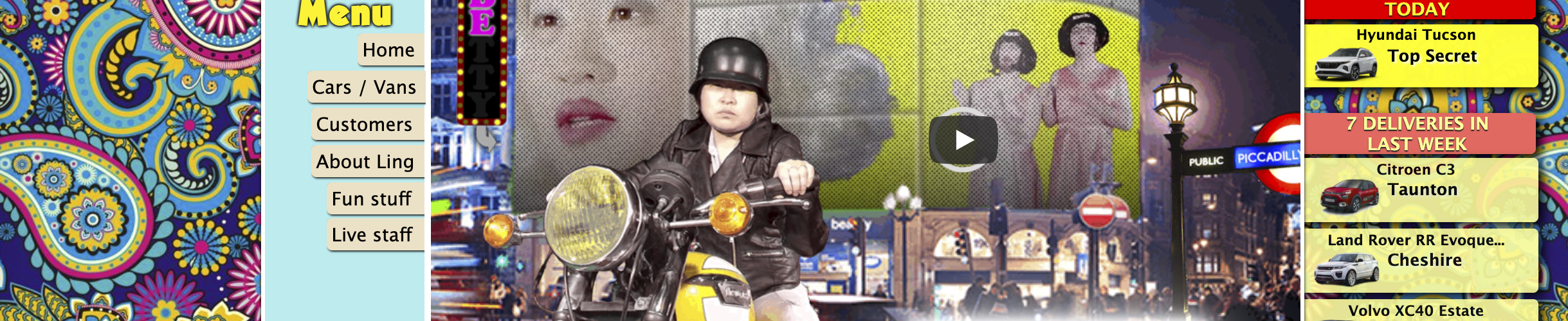
Here is the URL for my Worst of the Web site: https://www.lingscars.com/
The site makes me feel overwhelmed and lost by the amount of images, dissonant design (colors, typography, shapes), video playing in the background, confused navigation and disorganized content breaking the Structure, Simplicity, Visibility and Reuse.
Structure: No clear or consistent layout or design model.
Simplicity: Communication is not clear or simple.
Visibility: Too many different elements of design (type, color, shapes) and different interactivity.
Reuse: Elements are not consistent or have purpose.