Objective:
- Demonstrate basic understanding of UI (User Interface), UX (User Experience), Navigation and Interactivity in the design of user-friendly menus and navigation systems.
- Use fundamental composition, color, and typographic principles effectively in the design of aesthetic and functional layouts for the web.
Introduction:
In Assignment 1, Worst of the Web, you identified a site that had several UI Design issues and articulated, based on the UI Principles what the issues were.
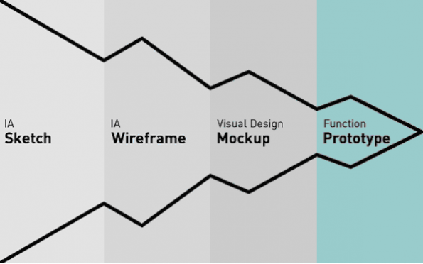
Continuing the understanding that UI Design is a complex process with many different parts (workflow), In Assignment 2, you will develop a proposal, site map and wireframe addressing the issues you identified in Assignment 1.
Considerations:
More often than not, in this phase of the project designers are still trying to close with the client. This is a great opportunity to show the client how professional and attentive to detail you are. Use rulers, grid paper, clean and smudge free hand work, proofread, etc.
Explore the different resources below:
- Principles of User Interface Design | Theory
- Elements and Principles of 2D Design | Theory
- UI Design Development | Theory to Practice
Assignment Value:
4 points
Grading Criteria:
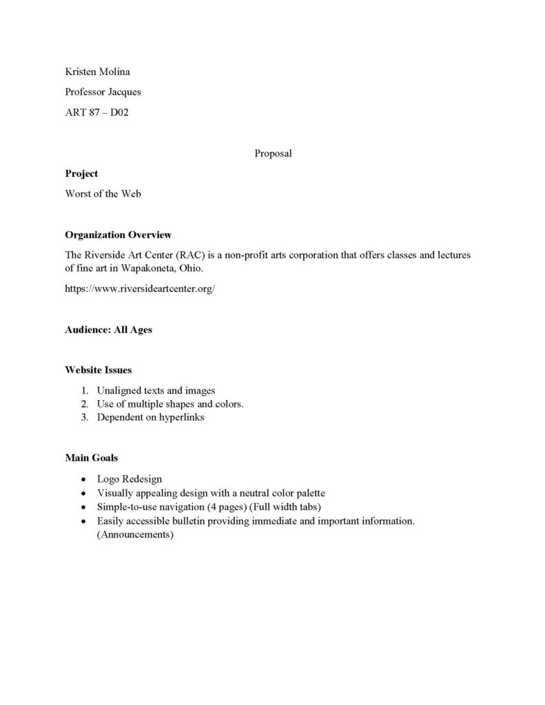
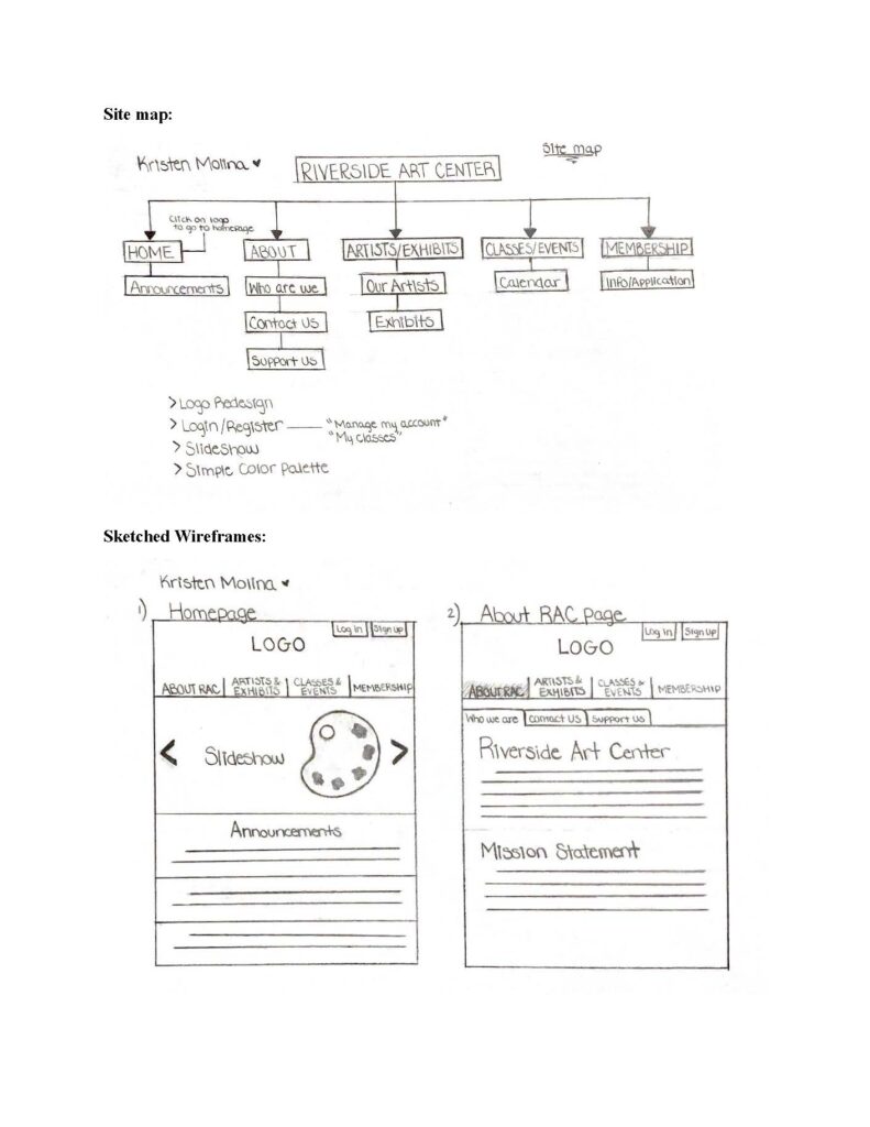
You are expected to create a proposal sharing the information architecture (site map) and a new design by drawing wireframes for four pages (home page and a second page) for web and phone in Photoshop (jpg).
In Blackboard, under Work Submission / Assignments / P1. Assignment 2 post:
- “Worst of the Web” site proposal in PDF – 1 pt
- Site Map in jpg or png – 1 pt
- “Worst of the Web” redesigned 4 wireframes in jpg or png – 2 pts
Sample:


