Objective:
- Demonstrate basic understanding of UI (User Interface), UX (User Experience), Navigation and Interactivity in the design of user-friendly menus and navigation systems.
- Use fundamental composition, color, and typographic principles effectively in the design of aesthetic and functional layouts for the web.
- Demonstrate intermediate understanding of pixel-based imaging and resolution in the production of mockups and web images.
- Apply understanding of digital imaging for web in the successful integration of images into web design.
Introduction:
In Assignment 1, Worst of the Web, you identified a site that had several UI Design issues and articulated, based on the UI Principles what the issues were.
In Assignment 2, you developed a proposal, site map and wireframe to help you get familiar with the content and plan your information architecture such as site map and menu navigation, and define how the content will be organized in the pages through wireframe sketches
In Assignments 3 and 4 you expanded your understanding that UI Design is a complex process with many different parts (workflow), in Assignment 3, you will develop the he design for four (4) pages for Web in Adobe XD. You were also asked to do Tutorial 2 | Adobe XD Steps 1 to 4 in order to familiarize yourself with XD and develop the needed skills to create the pages in the application.
In Assignment 5 you expanded the UI Design Workflow by improving your designs and linking the different pages and elements to create a the dynamic prototype. Make sure to do Tutorial 2 | Adobe XD Step 5 to learn the skills to develop prototypes in XD.
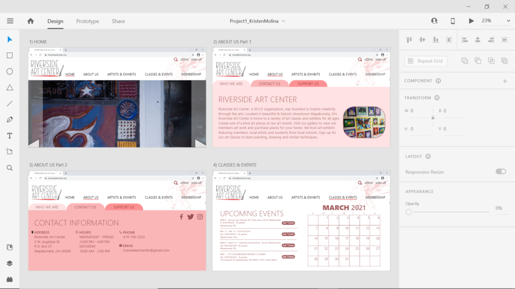
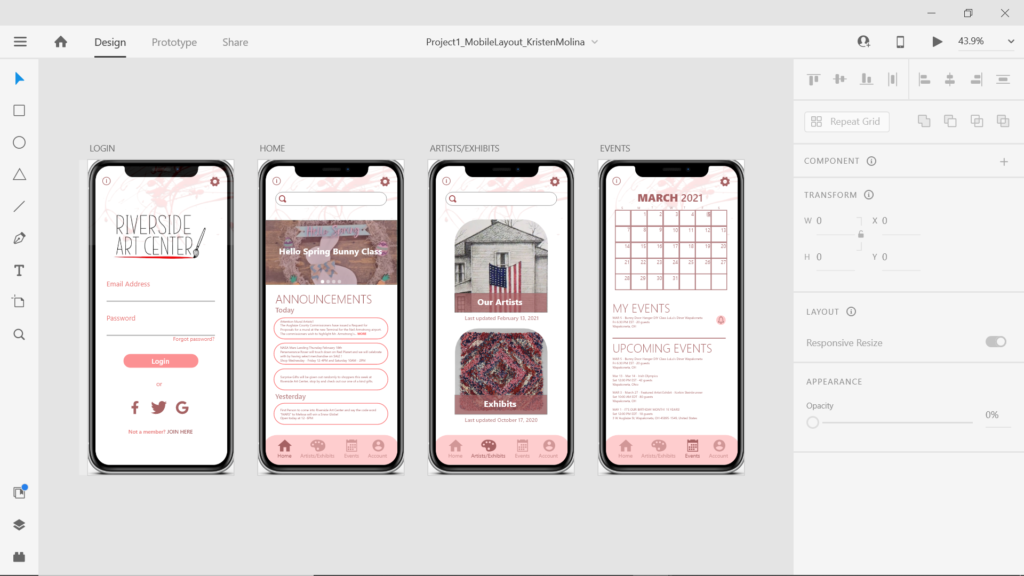
In Assignment 6 you will finalize your eight (8) pages – 4 for web and 4 for mobile, ensuring that the pages address the issues you identified in Project 1| Assignment 1 and the design is cohesive, functional and accessible. In Assignment 5 you expanded the UI Design Workflow by improving your designs and linking the different pages and elements to create a the dynamic prototype.
Considerations:
Design, Design, Design! Establish a Grid! Focus on Typography, Color and other Graphic Elements insuring that your assets (buttons, images, icons, favicons, etc) are consistent and promote Unity in the design and establish Visual Hierarchy.
I suggest you design this first sketch using Monochromatic Color Scheme and once the design is tight you explore Analogous or Complementary Color Schemes to enhance Emphasis and Focal Point, establish a stronger Visual Hierarchy and reading and interactivity Accessibility. Use this Color Calculator to help you define the colors based on the color schemes (also called Color Harmonies). https://www.sessions.edu/color-calculator/
Explore the different resources below:
- Principles of User Interface Design | Theory
- Elements and Principles of 2D Design | Theory
- Typography | Theory to Practice
- Color | Theory to Practice
- Unity | Theory to Practice
- Emphasis and Focal Point | Theory to Practice
- Visual Hierarchy | Theory to Practice
- UI Design Development | Theory to Practice
- Adobe XD
Assignment Value:
8 points
Grading Criteria:
In Blackboard, under Work Submission / Assignments / P1. Assignment 6 post the link to your XD Project 1 | Assignment 6 with the pages/elements linked plus jpg or png images of the eight pages. All four pages for web should be linked, and all four pages for mobile should be linked.
Finalize the web and mobile interactive prototypes in XD with four functional/linked pages each for midterm presentation.
- Four pages for Web prototyped in XD (link to XD) and their images in PNG are shared in Blackboard 2 pts
- Four pages for Mobile prototyped in XD (link to XD) and their images in PNG are shared in Blackboard 2 pts
- Design addressed the issues presented on Assignment 1 1 pt
- Design respects UI Principles 1 pt
- Design respects Design Principles 1 pt
- Presented work 1 pt
Sample:


